
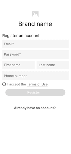
Screen 1
The user registers in the app or logs in with an existing account.
Screen 2
The database allows the user to access past diagnoses with current health and treatment plans.
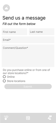
Screen 3
The user can leave a message for the the business and expect a response in 1-2 business days.
Before Testing
Prototype
I created a low-fidelity digital prototype for testing
I turned the screens from the user flow diagram into digital wireframes. This allowed me to spot the connection points between each screen in the user journey. Once I connected the screens, I created a functional prototype with animations and microinteractions for testing.


Satisfying Customers with Sick Plants with Current Health and Treatment Plans
Process
Empathize -> Define -> Ideate -> Prototype -> Test
Company: The Green House
Role: Lead UX/UI Designer
Version: 1.0
Timeline: May 2024 - Jun 2024, 6 weeks
Result: The native app allows customers to upload photos of their sick houseplants to receive complete diagnoses.
I am not affiliated with The Green House and created the business solely for the Google UX Design Certificate. The Green House sells houseplants to customers online and in stores. I designed an app to ensure the proper care of customer's houseplants.
Main Challenge
Customers noticed warning signs in sick plants
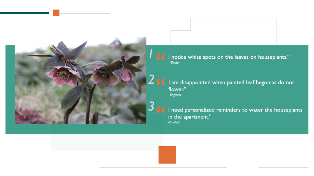
I formed a representative sample—a subset of the target population accurately reflecting the larger group—to conduct interviews. I uncovered that participants were noticing warning signs in their sick plants. The common observation plant owners noticed in their sick plants ranged from wilting to dehydration to off color. Participants needed a camera feature to be able to upload photos of these warning signs. This signaled an unmet need that competitors weren't addressing in the market.
Doctor: 65 years old
Engineer: 68 years old
Student: 29 years old
User Flow
I mapped uploading a photo to receive a fast diagnosis
Next, I mapped the main screens for a persona in the product in a user flow diagram. This step ensured that the user carried out a specific action before each screen. I understood the functionality of the product before building time-consuming wireframes and prototypes.
Circles: Actions
Rectangles: Screens
Diamonds: Decisions
Arrows: Move forward or backwards
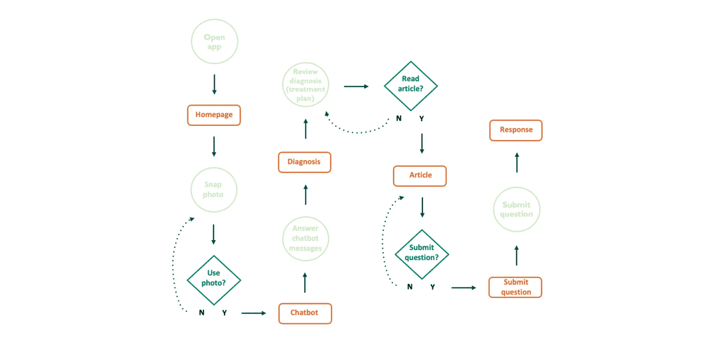
Use the app to identify and treat houseplant diseases speedily →
Research
I conducted a usability study to ground the design in reality
From testing I learned that the diagnosis with current health and treatment plan was useful for treating sick plants. I gained confidence that real users benefited from the feature in the app. There were 3 main KPIs measured including System Usability Scale in the usability study. The results from the System Usability Scale questionnaire with Participant 1:
I need the app the care for ill houseplants. (Agree)
I found the app easy to use. (Strongly Agree)
I am satisfied with the provided information in the app. (Agree)
I need additional training to use the app. (Agree)
I found the app to be frustrating at points. (Strongly Disagree)
I made 3 improvements to the low-fidelity prototypes after testing based on insights: users need to be able to find the camera, the support bot's purpose needs to be clearer, and users want to refer back to a database of articles.
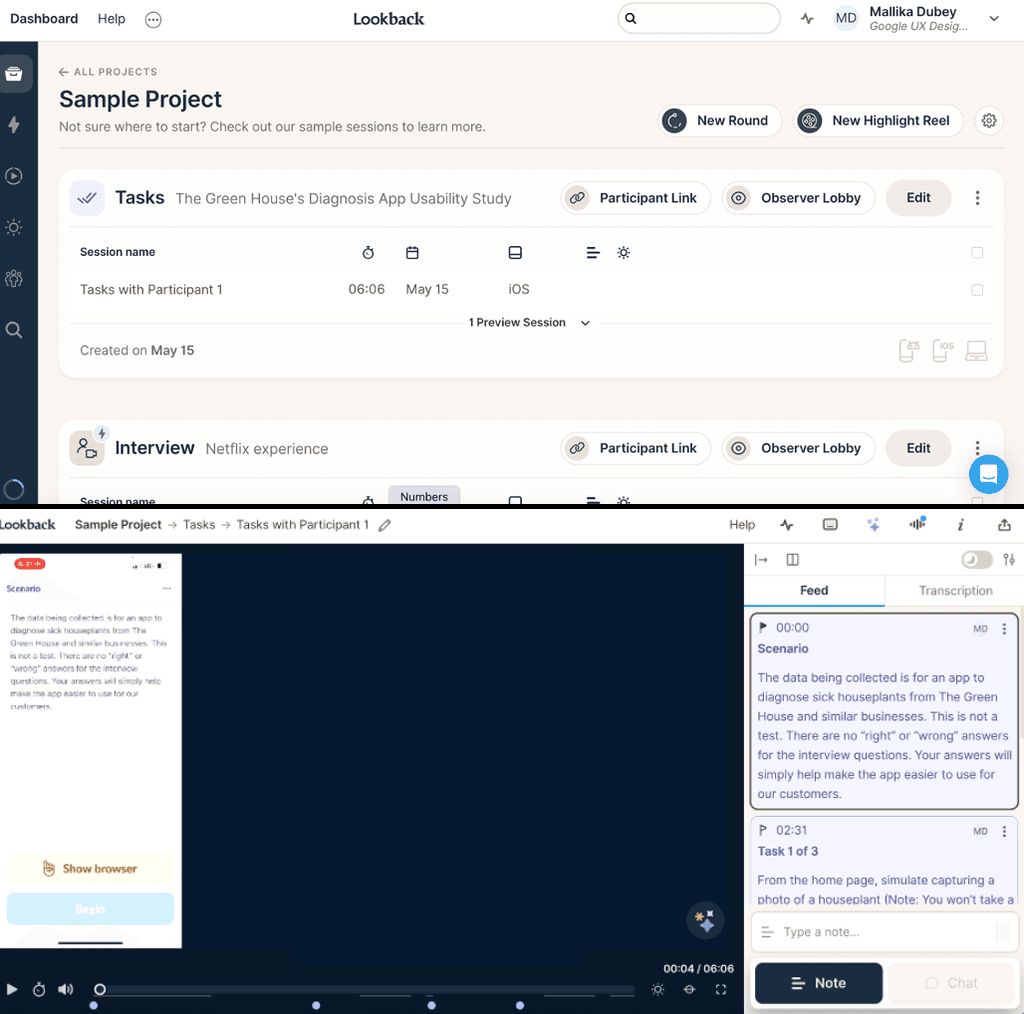
I created a session for each participant in Lookback


Before Testing
After Testing
Tapping the image does not clearly indicate opening the camera feature
More Navigation
Less Navigation
Final Screens
Design highlights core features in the app
I created a high-fidelity digital mockup based on the improved low-fidelity digital wireframes. It was important for visual design to accentuate uploading a picture, responding to the support bot, and receiving a fast diagnosis. I included visual design elements such as typography, color, iconography, containment, and negative space to accentuate these features.

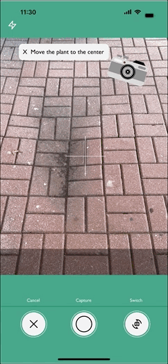
Step 1
The camera is accessible on the home screen with the option to enable the GPS tracker.
Step 3
The camera allows the user to capture a photo of the sick houseplant.
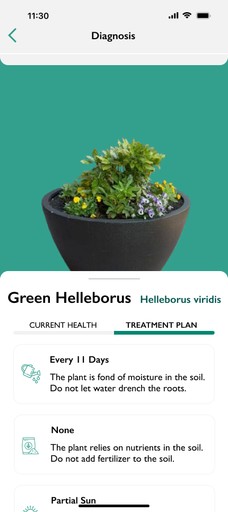
Step 2
The past diagnoses are stored in the app allowing the user to review current health and treatment plans.
After Testing


Step 4
After capturing a photo, the user is automatically prompted to answer three questions from the support bot.
Step 5
The user receives a diagnosis with current health. The icons represent moisture, height, quality, and disease.
Step 6
The user can switch the tab bar to a treatment plan.
After Testing

Next Steps
Releasing Version 2.0
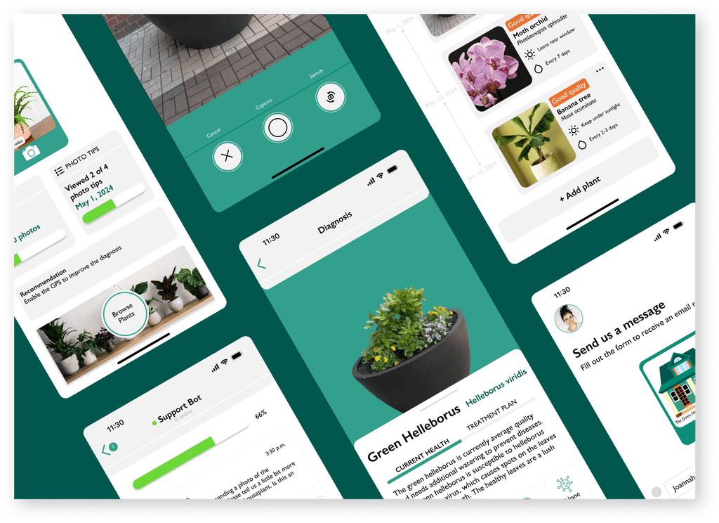
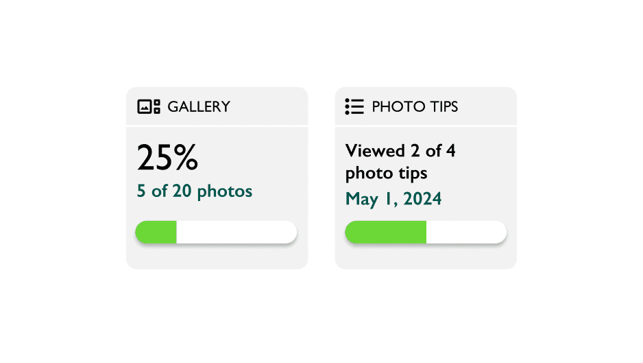
Due to the success of Version 1.0, I plan to release Version 2.0 with slight changes to the user interface. There will be a focus on the photos stored in the gallery and the tips to help capture photos of sick houseplants.
4
Tips to Capture Photos
20
Photos Stored in Gallery
Challenges
I encountered 3 edge cases deviating from the happy path
It occurred to me that users might not follow the standard user experience I outlined in the digital wireframes and mockup. I decided to account for these potential edge cases and reroute users on the happy path.
Challenge #1: User wants to re-upload houseplant photo
Challenge #2: User is uncertain how to achieve the best lighting in the photo
Challenge #3: User needs to review a past diagnosis again
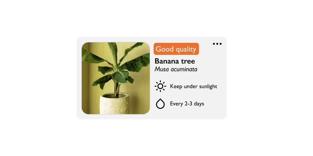
The cards allow the user to access past diagnoses
The photo tips guide the user to upload a photo
The gallery allows the user to access past photos